Graphic Design Good Design Vs Bad Design
The idea of design: good design vs bad design and how it affects our experience
![]()
Design is an integral part of our life, it's everywhere: from physical products like toothbrushes, which we use to start our day with to digital products that we can see on our mobile and computer screens.
For me, Design is a plan or a process we follow to put together ideas into reality. The outcome reality could be anything like a Physical Product ( Cars, Buildings) or a Digital Product (Zomato, Spotify).
How is design different from art?
People are debating about Design v/s Art for a long time, but there's been less closure on that topic. But For me, while explaining Design, I tried to focus on the most fundamental part of it. Design is there to serve a user's needs, and Art is to the artist's imagination (mostly). Many types of designs could be considered as art like Graphic Design, Illustration, but when it comes to the more functional design like Physical Product Design, Industrial Design, and Digital Design, it is more of a data-driven process.
Good Design v/s Bad Design
Good Design
A design can be considered as a good design if it's useful, easy to understand, better user experience, and honest to its purpose. Mostly finding good design is hard.
Like Don Norman Said "Good design is actually a lot harder to notice than poor design, in part because good designs fit our needs so well that the design is invisible."
Bad Design
Bad Design on the other hand is quite easy to spot. It could be a bad color combination on a website, an over-the-top design that doesn't satisfy user needs,or some feature that makes the user experience annoying.
Like Don Norman Said "Bad design, on the other hand, screams out its inadequacies, making itself very noticeable."
When it comes to deciding between Good Design and Bad Design , it could create a lot of bias and confusion in most people.
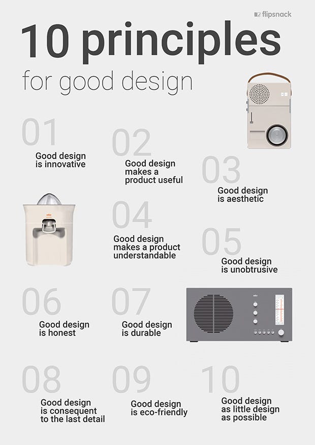
But nothing to worry about, a German industrial designer, Dieter Rams , came up with his idea of good design in the late 70s, called as " 10 Principles for Good Design ", which is a list of principles to follow to evaluate a design, is still relevant to designers around the world.
So, in this article, I'll tell you about my personal experience of good and bad design.
Now, these are some examples of physical and digital designs around me and my experience with them.
5 Examples of Bad Design
Wall Clock
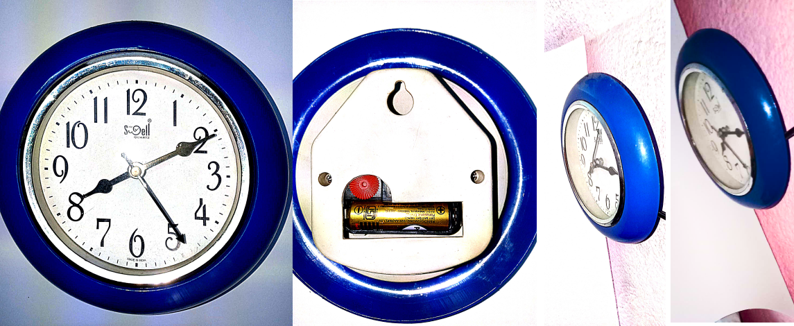
This is a wall clock by Swell Quartz. It may look like a normal clock but it's not at all a well-designed clock.
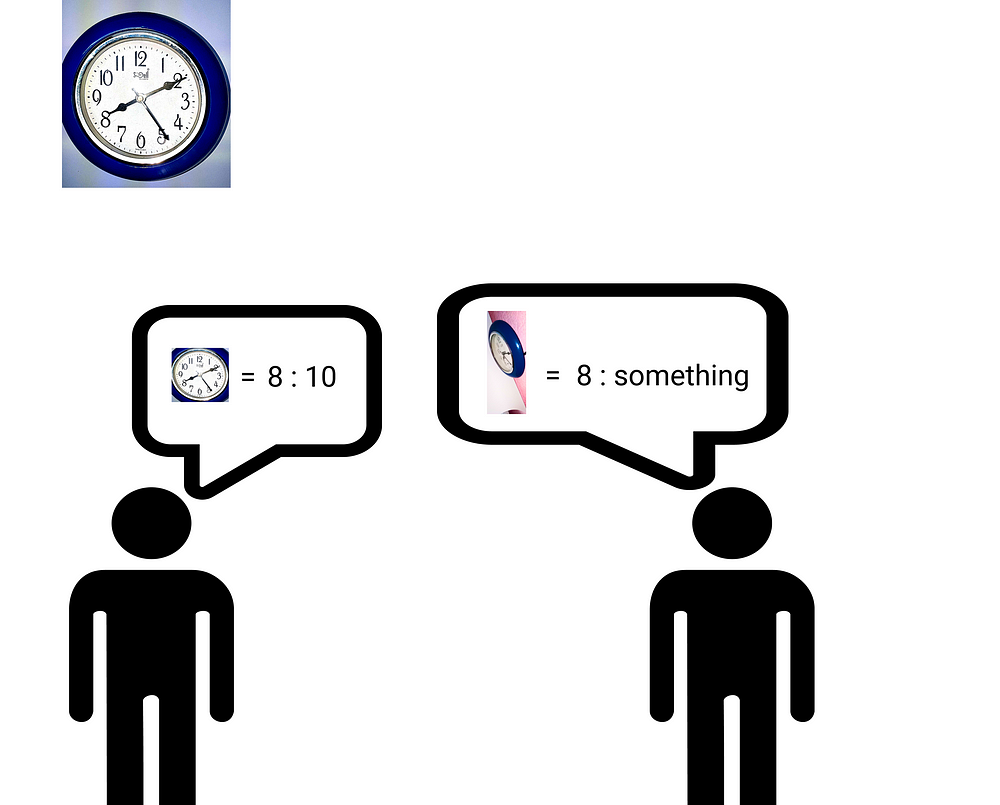
According to the back view, we can see that it is supposed to be hanged on the wall, not a table clock. So if someone who's at a corner of the room sees the clock he can't tell the time. According to the image, we can see that the clock is barely visible.
The surrounding blue edge of the clock is an example of obtrusive design. It made the product useless.
So this is a Bad Design .
Ceiling Fan Regulator
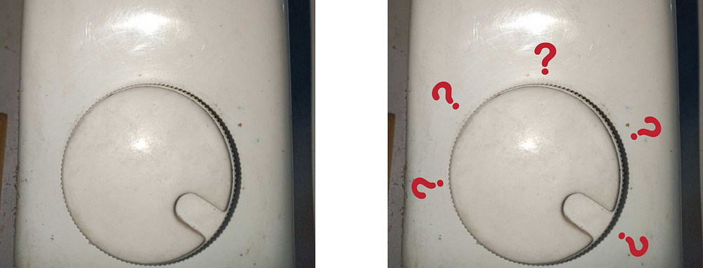
This is probably one of the most annoying situations we can face with a fan's regulator. It has no numeric markings of the fan's speed. We have to tune it multiple times to find the sweet Spot :(
It is not a good user experience. So this is a Bad Design .
USB Drive
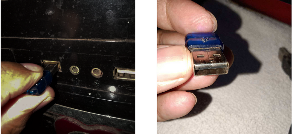
So. How many of you face this problem?. Me! literally every day. I don't know why hasn't anyone fixed it yet!. But plugging a USB drive in a hurry is the most annoying thing. It doesn't have any indications or markings for the top or bottom to plug it in. So this is a really bad user experience.
This is a Bad Design .
WhatsApp Delete Message Feature
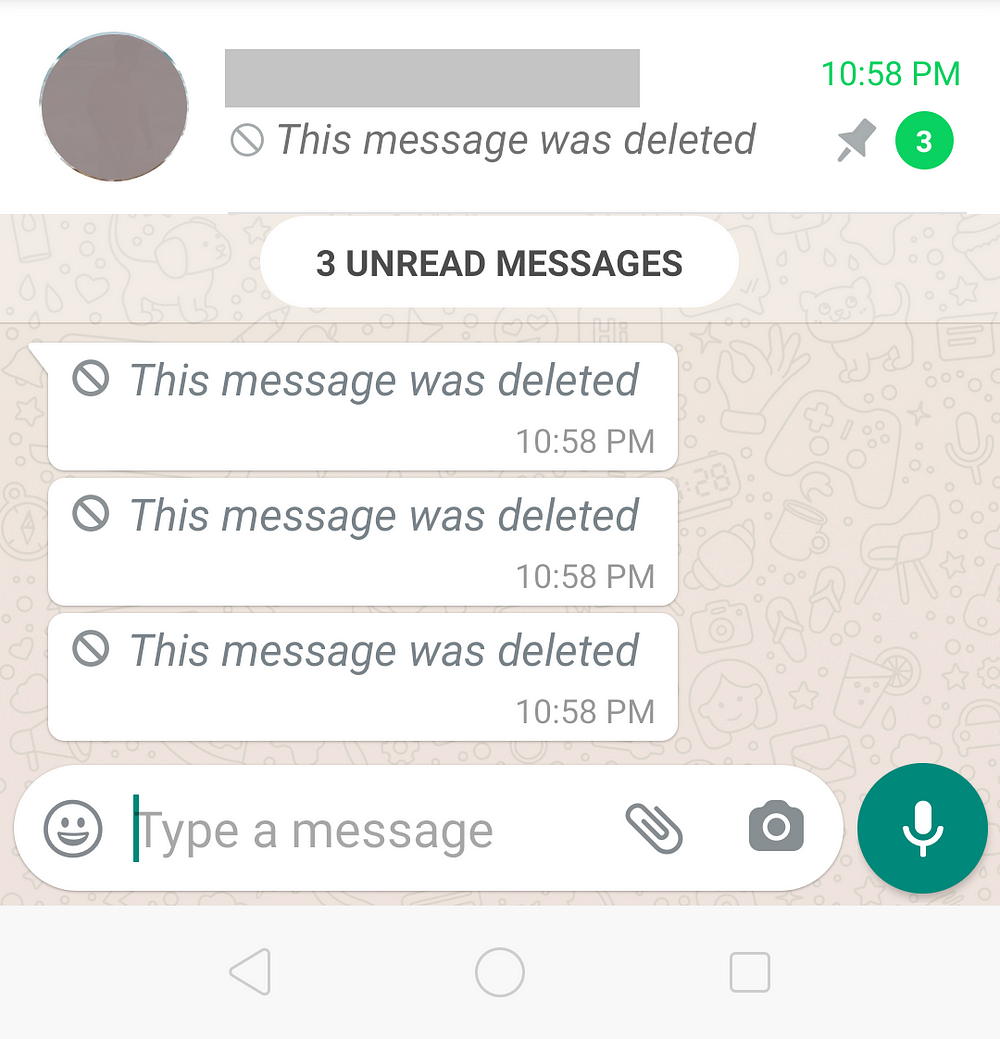
Whatsapp is known for its clean User interface and good app experience, but the delete message feature in WhatsApp kinda ruins it. If you send a message to someone by mistake and then delete it, it shows a "This message was deleted " statement. it actually doesn't serve the purpose of deleting the message. After seeing the delete message comment, the message receiver gets suspicious and starts asking questions about what was that about ? 🧐. This kinda makes the experience a bit awkward.
So This Feature is a Bad Design .
WhatsApp Group member's number interaction Feature
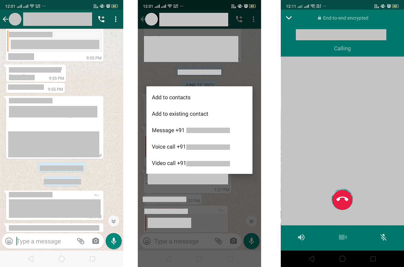
Another WhatsApp feature with questionable UI, I don't know how many of you faced this problem but I did. While scrolling through group messages if I accidentally click on a number in the group and then the additional menu (Add to contact, message, voice, and video call)opens, and a voice call or video call goes to that person from my one single wrong tap, Now I have to explain to the call receiver that I wasn't stalking that person's profile picture or info 😑. This is WhatsApp's another "making the user awkward" feature. I think they can make this feature better by putting the additional menu either at the topmost of the screen or at the bottom, but away from the middle screen to avoid misclick.
So for me, This Feature is a Bad Design .
5 Examples of Good Design
Desk Pen
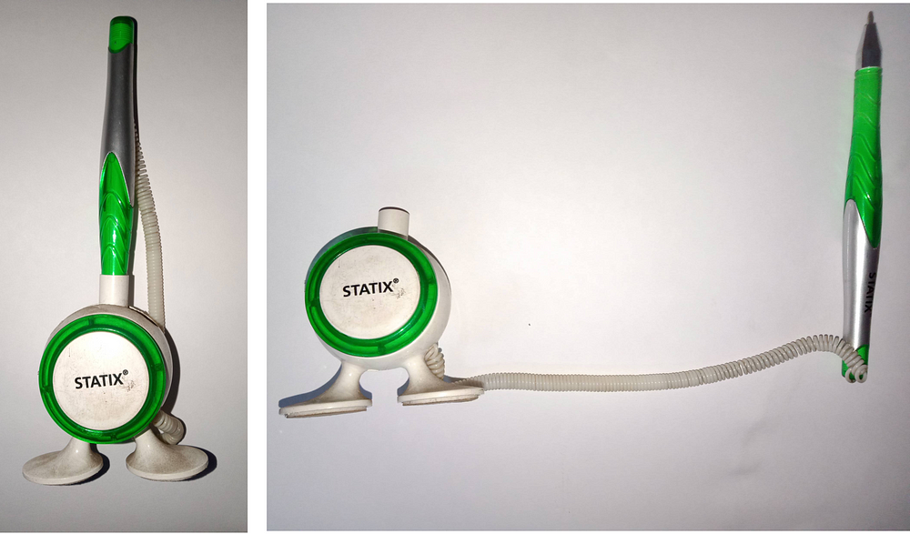
This is a Desk Pen by Statix.
There's no one, who hasn't lost a pen from the Desk, either it falls off the desk backside or got lost in the unknown. So Desk pen is good at serving its purpose. It's visually appealing, long-range of wire connected between the pen and the box. The design is minimal, honest, long-lasting, and Useful.
This is a Good Design .
Kitchen Cleaner
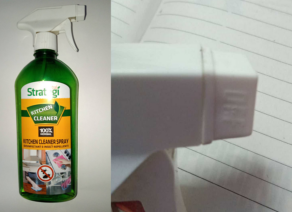
This is a Kitchen Cleaner by Strategi.
It is a spray cleaning tool with the purpose to clean Kitchen, and it does its job very well. It has 2 types of features ( SPRAY and STREAM ) for different kinds of stains for a better experience while cleaning.
The design is visually appealing, good typography, and useful.
This is a Good Design.
Hand Sanitizer
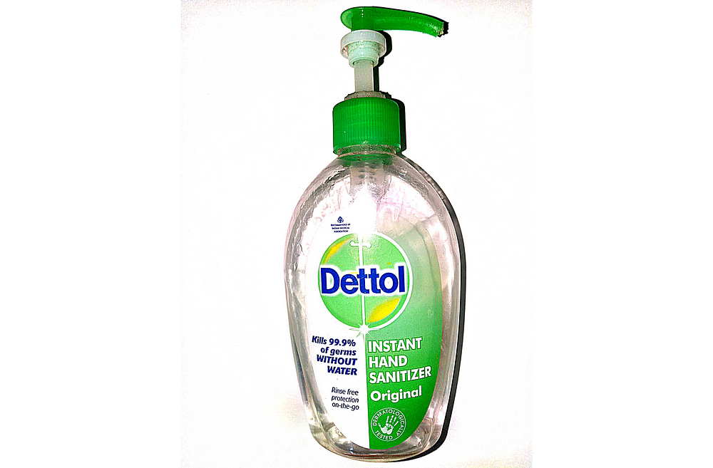
This is a Hand Sanitizer by Dettol.
We are now in pandemic times so sanitizer is an essential item in our daily life. the top pressing feature of the Dettol sanitizer is quite useful. Most of the sanitizers are small bottles with caps on them. So you have to open the cap with germs on your hand then put sanitizer on your hand and then closing the germy cap with your sanitized hand. Now, this makes no sense. Here this Dettol sanitizer is quite useful in that sense, you can press on top of it with the end of your palm and then use it without directly touching the bottle.
The design of this bottle is really innovative, minimal, visually appealing, and understandable.
This is a Good Design .
JioSaavn Search Feature
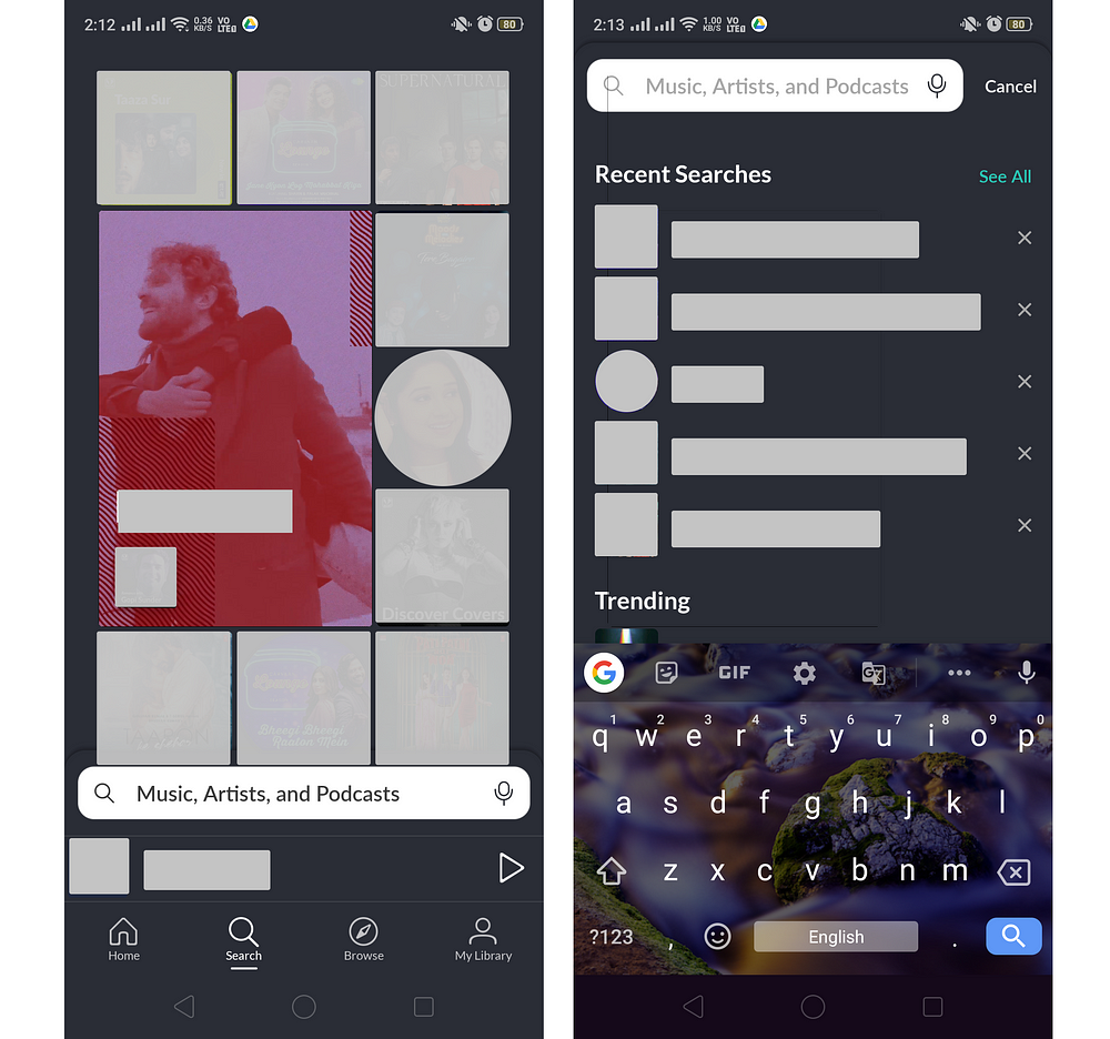
JioSaavn is probably one of the well-designed online music platforms out there, both from the user interface and experience point of view.
And its newly updated search bar placement made the user experience far better, before searching for songs you have to move your hand up to type your song /album name, but now it's close to your fingertips with animated albums and suggested albums to choose from.
This Design is well organized, easy to use, visually appealing, and better interaction availability.
This is a Good Design .
The Sandwich Spot Website
I came across The Sandwich Spot website while doing a project on Food Websites. This website is a great example of enhanced user experience and accessibility.
The design is visually appealing, good typography, an Order button on the top of the page, if you're in a hurry to order some food in 3/4 clicks, and wide availability of accessible profiles to help disabled users.
This is a Good Design .
Learnings
Throughout these examples, we can see how different designs of a product can change our experience with it. Some products are easy to use and understand, some are confusing and misleading.
I hope some of these can be relatable to you.
Thanks for Reading! 🤗
Graphic Design Good Design Vs Bad Design
Source: https://bootcamp.uxdesign.cc/the-idea-of-design-good-design-v-s-bad-design-and-how-it-affects-our-experience-3ee3bd405f82
0 Response to "Graphic Design Good Design Vs Bad Design"
Post a Comment